You must forgive that this is merely the thought process of a hobbyist, rather than a tutorial from an expert. In a world awash with blinding, over-saturated colour photos, plenty has been written on this subject in response, but I felt it might help some readers (especially those just starting out in photography) to elaborate on my decision-making process and reasons for rendering or shooting an image in black and white (B+W). Your rationales may be different, of course, but by articulating mine it might help an understanding of what makes black and white images so appealing.
Rest assured I absolutely love colour, and when I first started shooting eons ago I was somewhat indifferent, perhaps even a little averse, to B+W. Colour was everything, and even the simple juxtaposition of primary colours in an image was satisfying enough.
For some images, colour is either part or all of the subject. A beautiful sunset, for example, doesn’t look very spectacular de-saturated of its colour. Nor do richly colourful plants or flowers. But, as I have mentioned in previous articles, stripping colour away from the right image can deconstruct its components to emphasise their shapes, textures and light, and each of these alone can form the subject of the image regardless of what they describe within it. Perhaps even the mood of the scene can change in the absence of colour.
Revealing the inter-tonal relationships or light and shadow within an image can evoke a different response or appreciation from the viewer than if the image is in colour. Colour can thus be a distraction from or a mask for such relationships. B+W is also versatile enough to apply to almost any subject, be it landscape, street, wildlife or portraits.
Whenever I take an image now, I almost always ask if the colour adds anything to it. Is the colour necessary or expendable to the image, and would the image therefore be just as, if not more, effective without the colour in it? I’ll usually shoot in colour with a view to rendering in B+W afterwards, but on occasion I’ll use one of the Art Filters on my camera and shoot directly to B+W in-camera. This allows me to see what the result could look like, and if it’s not to my liking, my camera (Olympus EM-5) generously creates an original colour RAW file alongside it so that I may adjust that on my own in post.
(SOOC JPEG from the camera’s B+W Art Filter)
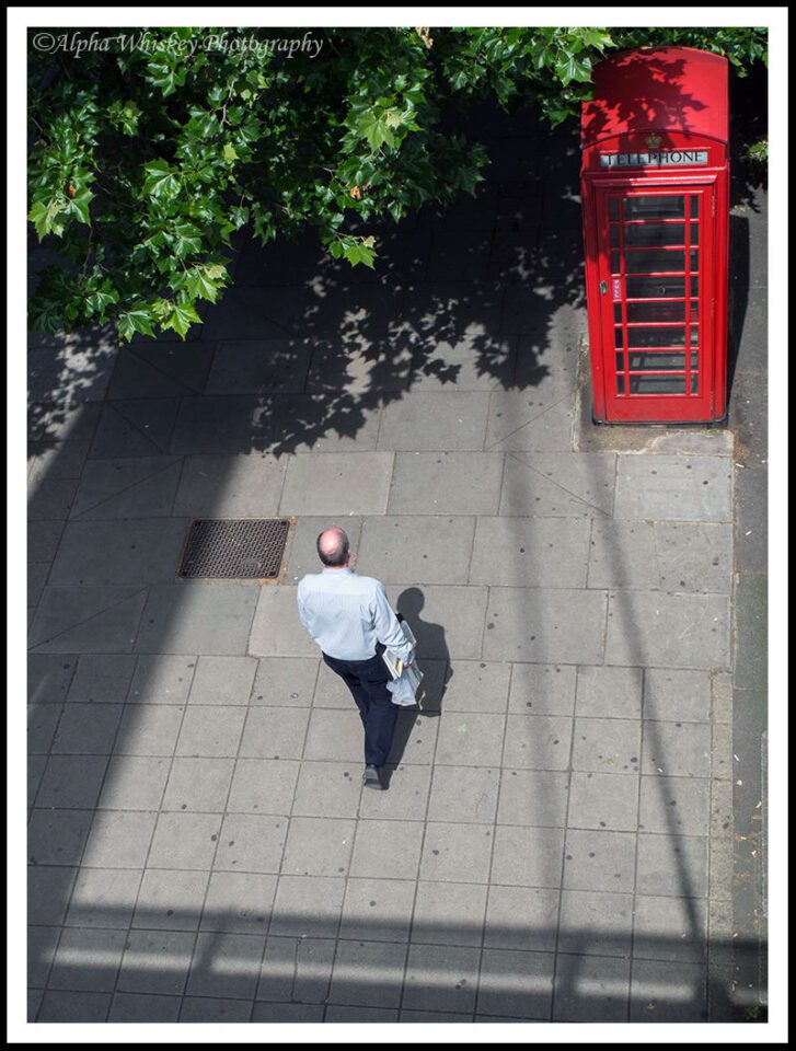
With time one learns to ‘see’ beyond the colours of a scene, switching them off in the minds eye. One can then determine if an image would work in B+W before making the shot, and this opens up many more possibilities to our shooting experience. Below is such an example. A simple shot taken from a bridge of a guy walking down the street, and one I took knowing I wanted to render it in B+W later. He is framed by some shadow and with some deep colours from the foliage and phone box. Not a particularly interesting shot.
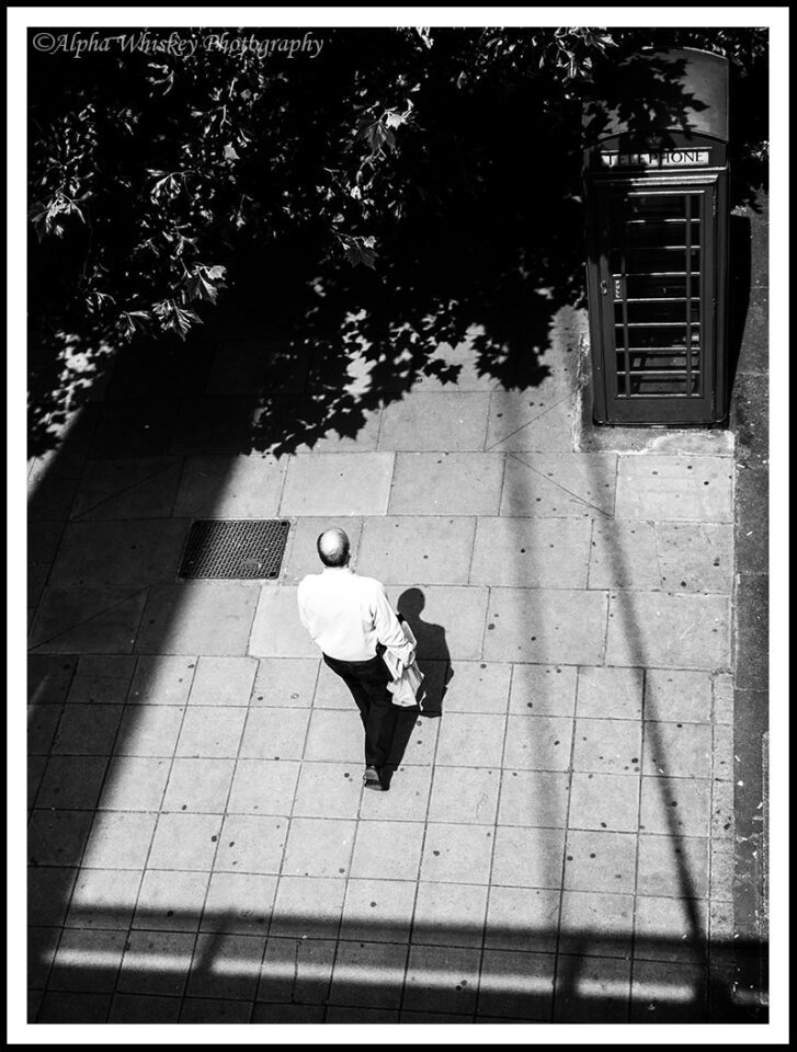
But with the colour removed and rendered B+W, it becomes more about the shadow frame and the contrast between the light and dark, emphasising the man’s place in the centre. He is also partially framed by his own dark trousers and shadow. Arguably still not a very interesting subject, but perhaps rendered in a more interesting way without the distraction of colour. Seeing the shadows and the frame it created are what inspired me to think of a B+W rendition; then all I had to do was wait for someone to walk into the frame.
Another example below, taken on the same day, with a view to rendering in B+W later in post. Again, just a random, uninteresting shot of a woman walking through a passageway on London’s Strand. But the contrasting areas of light and shadow gave me the idea for B+W here.
And with the colour removed, this contrast between light and shade is emphasised. The random pedestrian now becomes something of a focal point as the intersecting light and shadow seems to lead the eye towards her.
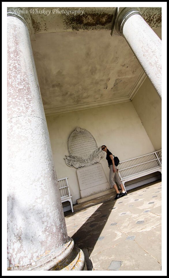
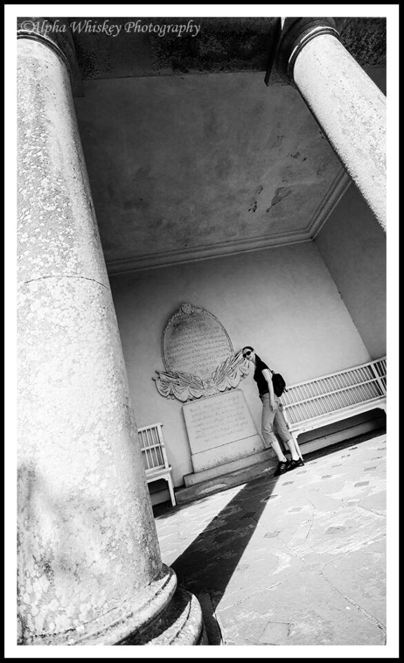
Here’s an example with a more specific intent. My friend wanted a photo of herself inside this temple.
In colour it’s not a very interesting shot to me, but in B+W I can use the shadow from the pillar to lead the eye to her. With some selective curves adjustment and dodging and burning, the contrast in black and white render her more starkly to the viewer’s eye as the focal point in the image.
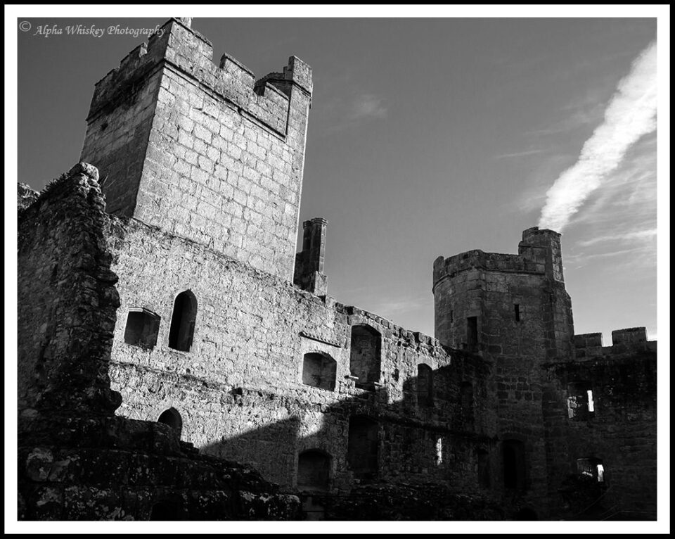
B+W often has connotations of something old or historical, and to that end it can be used to evoke a bygone era. Many of the shots I take in historical buildings will be rendered in B+W for this very reason. Both externally…
…and internally.
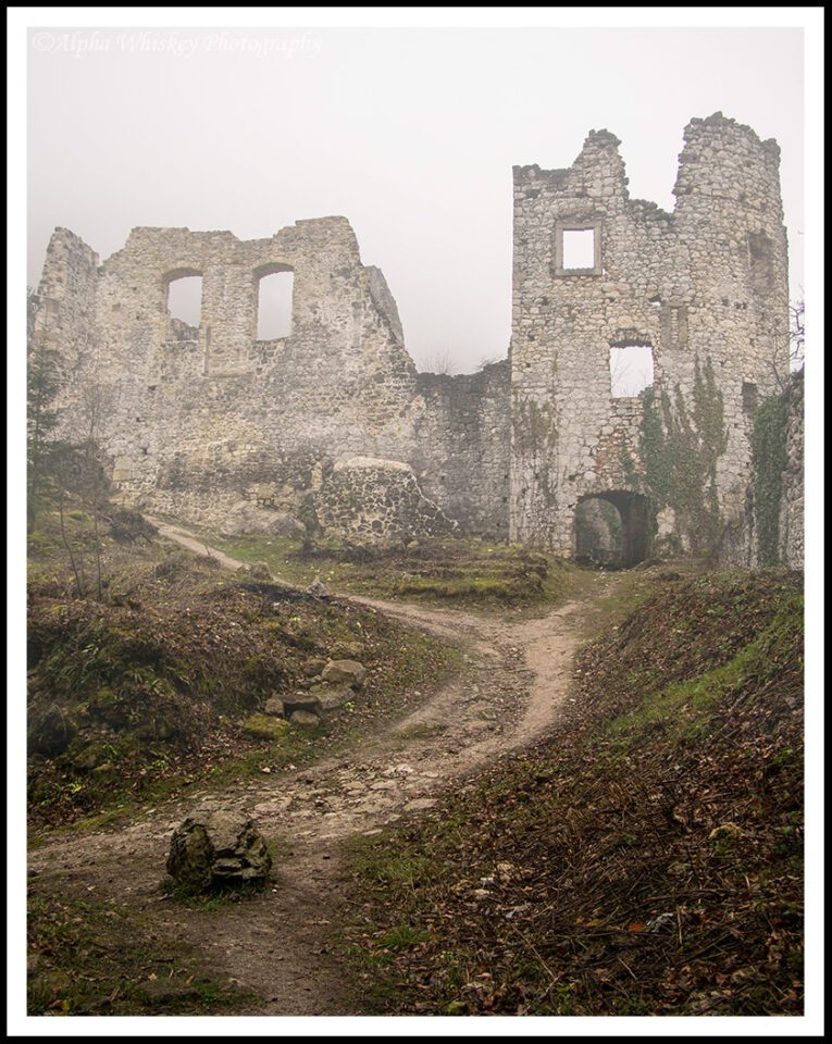
Additionally, mood and atmosphere can also be affected by B+W. When I found the ruins of this fortress atop a hill in Croatia an eerie mist was descending upon it.
Atmospheric enough, but then removing the colour made it seem even more desolate and mysterious to me.
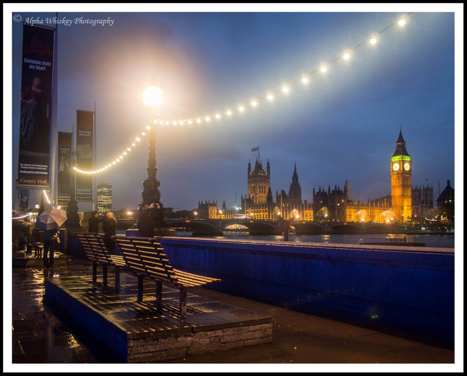
This shot below of Westminster Palace from the South Bank was taken in the rain. I rather like the colour version; it has areas of primary colours and light playing of each other and balancing the image (in my view). The diffuse lighting and shiny wet surfaces allude to the mist from the rain.
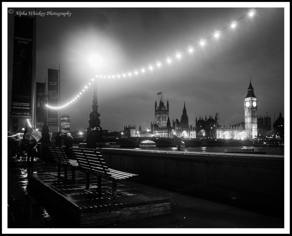
Now without the colour, I think it has a little more atmosphere, with the light areas breaking up a somewhat eerie scene.
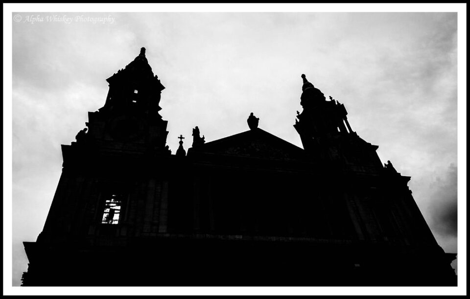
One of the commonest reasons for rendering or shooting an image in B+W is to hide a dreary or featureless sky, and I’m not immune to that reason. I like to shoot on nice days with clear skies, but bad weather lends itself to B+W photography. I took a couple of friends on a photowalk around St Paul’s Cathedral a while ago and the sky was a dull grey. So I used the B+W Art filter on my camera to shoot this silhouette of the cathedral, exposing for the light areas to deepen the blacks (SOOC JPEG).
Below is how it would have looked like otherwise (processed from the RAW file). Dull sky and dull image. The B+W above is far more dramatic and atmospheric.
In contrast, you might use B+W to make a sky more dramatic, especially where there is an interesting cloud pattern. In the shot below, the sky is already the subject of the image, with the train giving a horizon to anchor the shot.
Without the colour, the sky looks more dramatic to me and trails my eye down to the silhouette of the train.
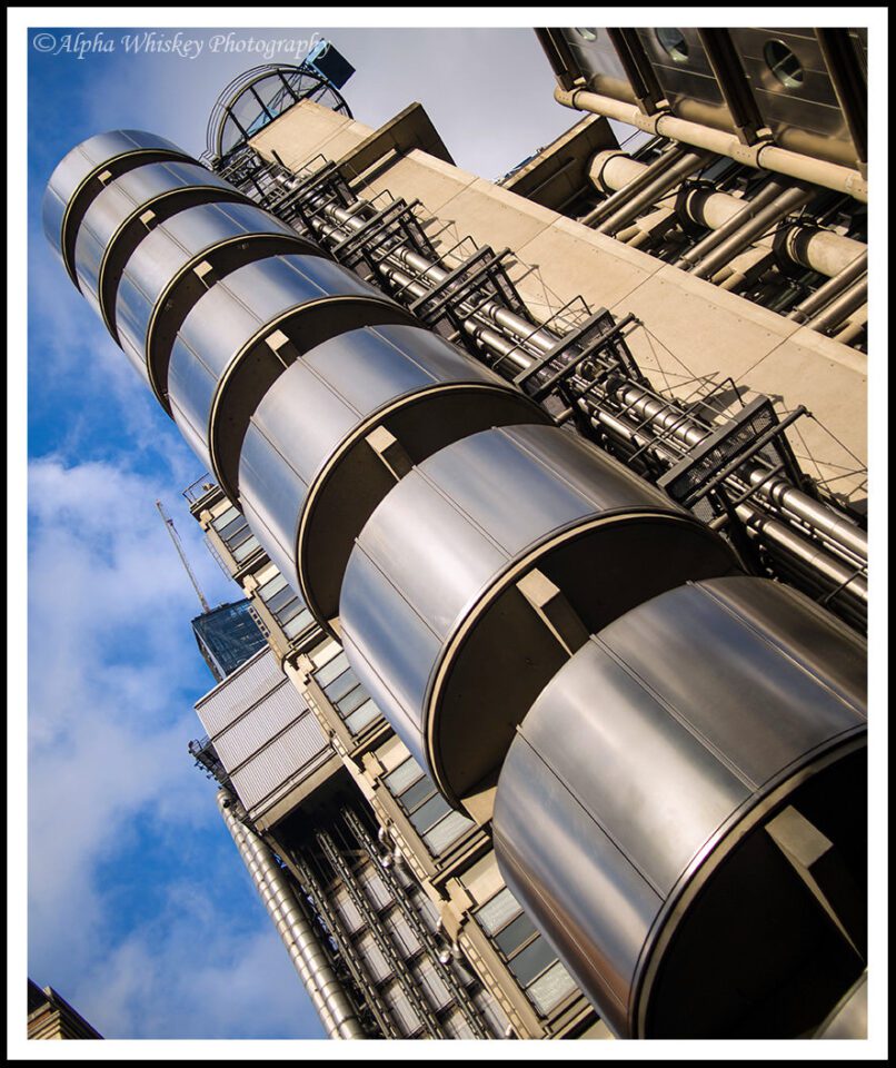
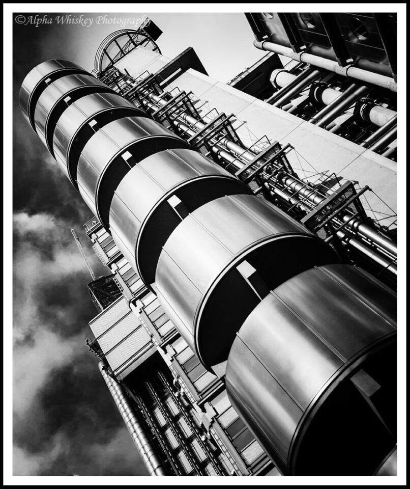
With architecture, B+W is often more effective at emphasising the geometry and shapes of a building. I have also tilted this image to take the perception bias away from the building and onto the lines and shapes leading the eye into the shot. A slight curves adjustment to deepen the blacks and some dodging on the cylinders help too. (I also removed the distraction from the bottom left corner.)
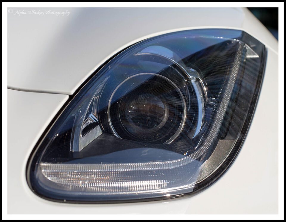
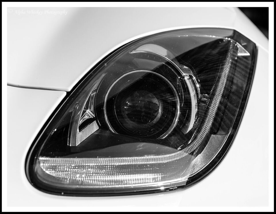
Even with simple details, B+W can draw out details and textures, as in this headlight of my…. ahem…. someone’s Jaguar F-Type.
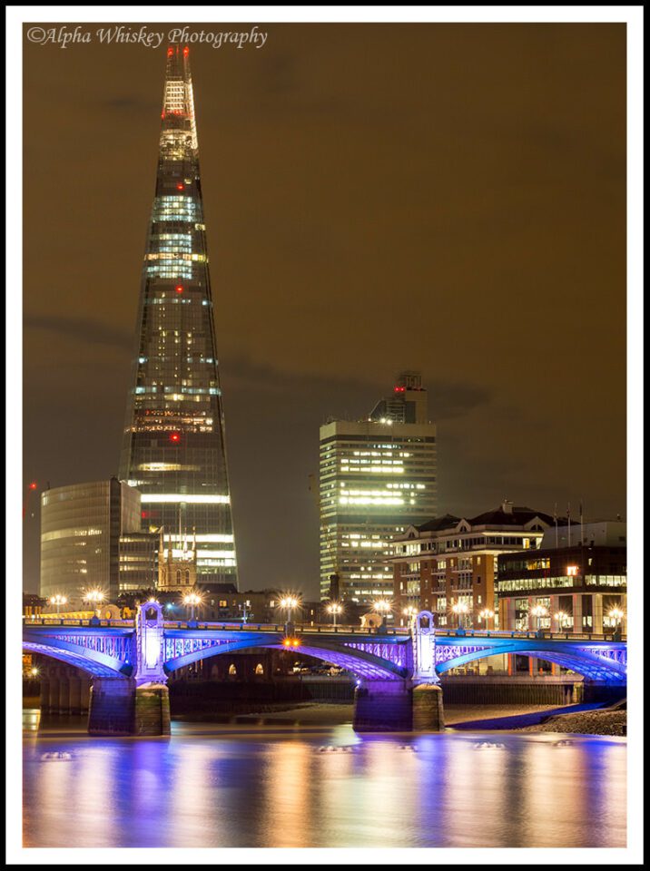
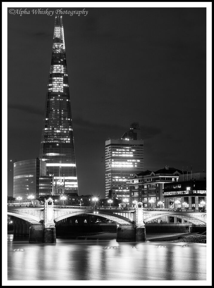
I had discussed my attempts at fine art B+W landscapes in a previous article, but cityscapes lend themselves to this treatment as well. This long exposure of the Shard in London appeals to me in colour, but in B+W it seems to have more of a fine art gravitas, if I can put it that way.
In terms of processing, I use the B+W tab in Lightroom and then selectively move the colour sliders around in the HSL/Color/B&W tab below (as described in a previous article). I’ll also dodge and burn to emphasise the subject, or apply a curves adjustment to increase contrast. If I shoot in colour first then I always shoot RAW, as this gives me far greater latitude in exploiting as much tonal range in the scene as I can. Processing JPEGs, you may find there are more artefacts and obvious demarcations between the tones. The EM-5, however, makes pretty good B+W JPEGs in camera using its Art Filter.
Of course, much of this is my subjective perception, and you may have your own take on rendering or shooting in B+W. But perhaps this may articulate a few of my thoughts on the subject for some people who are still as tentative as I used to be in making B+W images. Thank you for reading.











0 comments:
Post a Comment